Branding and Website Design
Cardinal pay
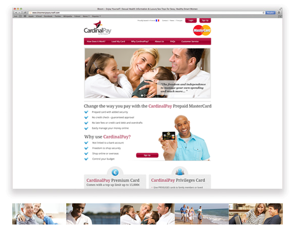
Clearly connecting with the five target audiences for prepaid Mastercards using storytelling, imagery and case studies to promote and sell the premier and privileges cards to French clients that cannot obtain lines of credit through their local banks. Customers are assured through case studies that they can qualify for, and safely use, a payment solution to meet their banking needs.
Industry
Finance
B2B
Services
Branding
Web Design

Project Description
Logo & Brand Elements
The Cardinal bird image helps to affirm the brand name while the illustrative style shows security, stability and approachability. The geometric style reflects a more dynamic brand, while retaining all the dependable feel of strong geometric forms. Curvilinear form creates visual depth and infers ease of use, lightness.


Website
Ease of use by the target audience was key in the design of the website. Primary navigation needed to make it easy to buy and load a pre-paid Mastercard. All imagery in the website was created to project a secure, stable and established solution backed by a French company, PBS Finance.
PPM Services
- Brand development
- Website development
- Competitive research
- Marketing communications and copywriting
Pivot Point Marketing was able to help CardinalPay differentiate ourselves from other French prepaid Mastercard companies by instilling trust through the brand imagery, website copy and case studies. The team was very talented and capable in creating both our logo and website. Well done.
